Commercial Trends : 2018
Hey guys! I've been collecting inspirational photos on Pinterest and I've decided to break them down into individual trends of 2018. I had so much fun writing this post, because I love love love these current trends.
I'd like to start with clarifying the difference between Commercial Design and Residential Design. Commercial Design includes everything from hotels, to restaurants, to spas, and all the way to airports. Residential Design just includes homes. This post lists selected trends that I've been seeing in offices, restaurants, retail stores, and hotels.
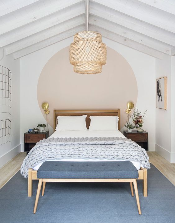
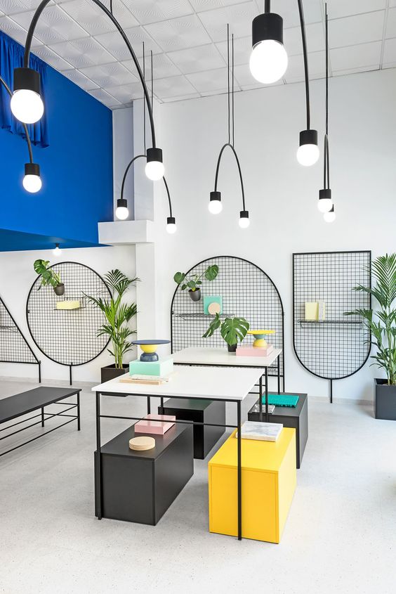
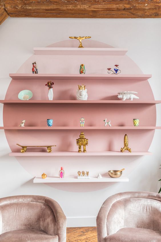
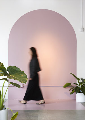
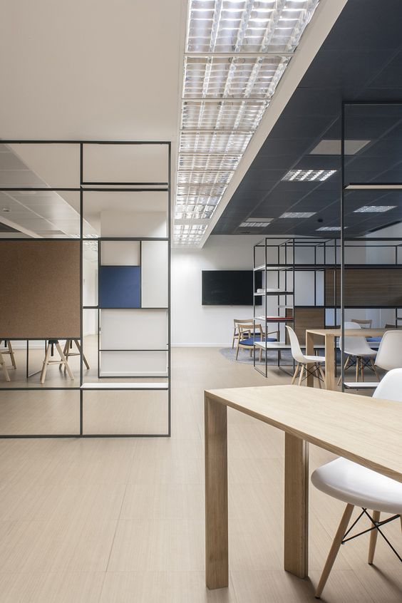
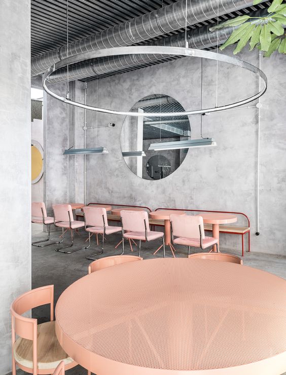
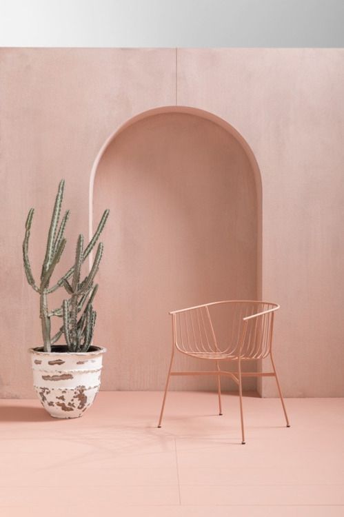
The first trend I want to talk about is circular shapes or arches. I've been seeing these everywhere and I've even incorporated them into some of my own designs, like the L'Oreal Women of Worth project. These shapes are being expressed through paint treatments applied directly to the wall and by external ways like the wire frame you see below.
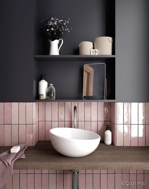
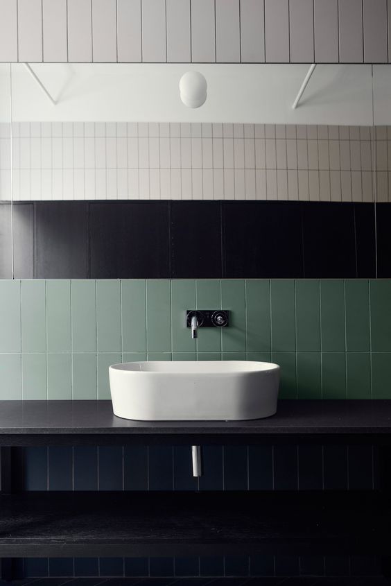
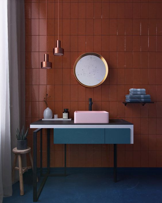
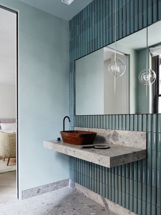
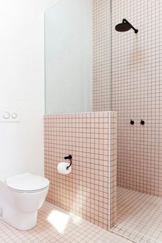
So we all know what subway tile is.. we've seen it all over the place in 2017. This year, I'm seeing the same tile, just flipped 90 degrees. I'm loving it. Vertical tiles are taking the kitchen and bath world by storm. We're also seeing different colors, which is a fresh new take on the classic white subway tile.
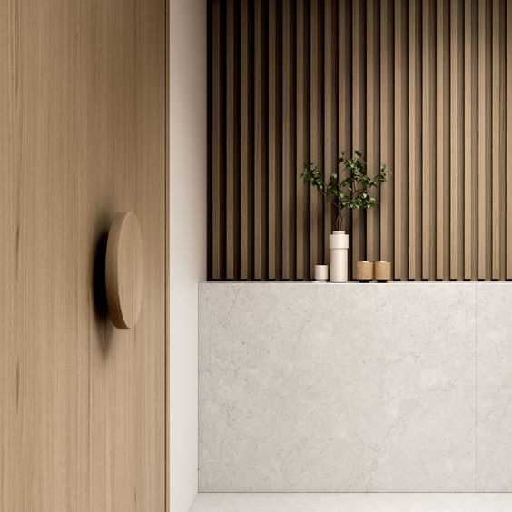
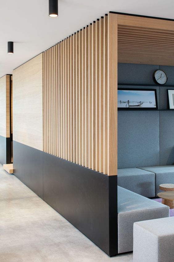
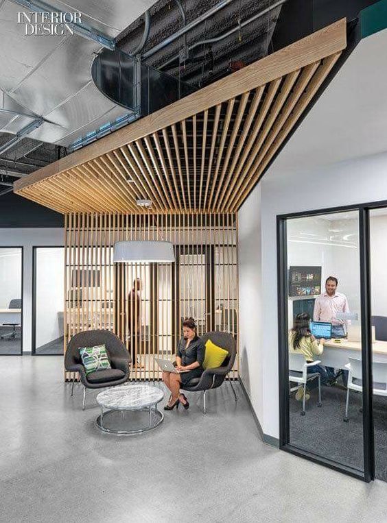
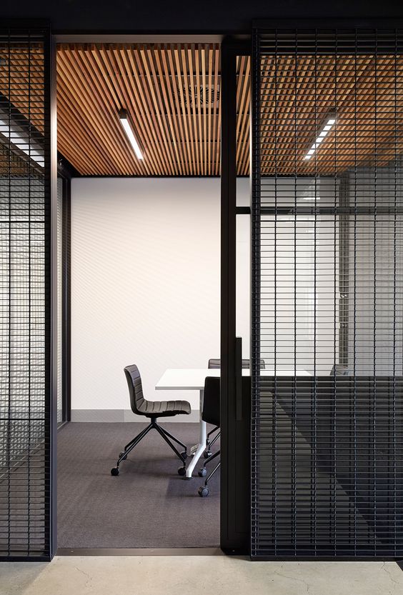
The next trend I want to talk about are vertical wood panels. These babies are beautiful and add a hip and modern touch to any room. The office where I had my internship at had these on the ceiling with light illuminating them from behind. I remember that was the first thing I noticed when I walked into NVE for the first time. Talk about a statement piece!
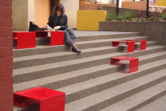
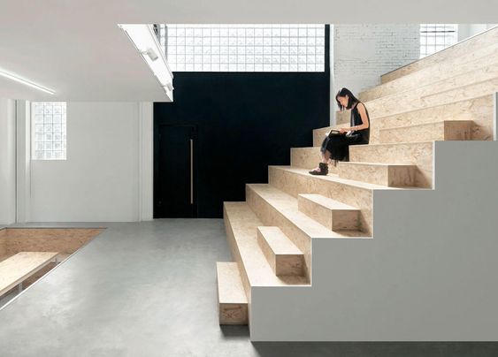
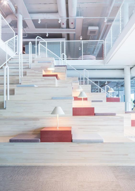
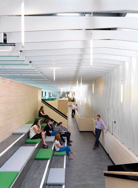
Alright, let's talk about stair step seating. The first time I saw this type of community lounge was in Anaheim's Packing House. I then saw it again in Blue Bottle Coffee at the Platform in Culver City. I think that this is a really interesting concept. It's a great utilization of space and it looks great. It's not the most comfortable to sit in, but again, this is preferable depending on the place. Coffee shops don't want people sitting with their laptops for hours at a time, because it drives away business.. That's why in the past 15 years, Starbucks has gone from having super comfy armchairs to having iron and wood bar stools. Design is everything!
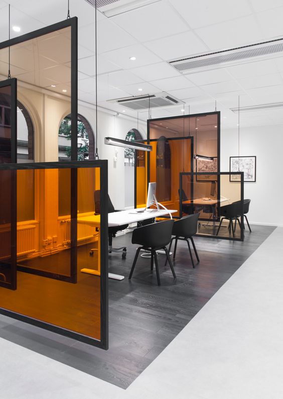
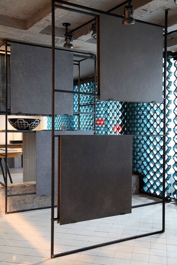
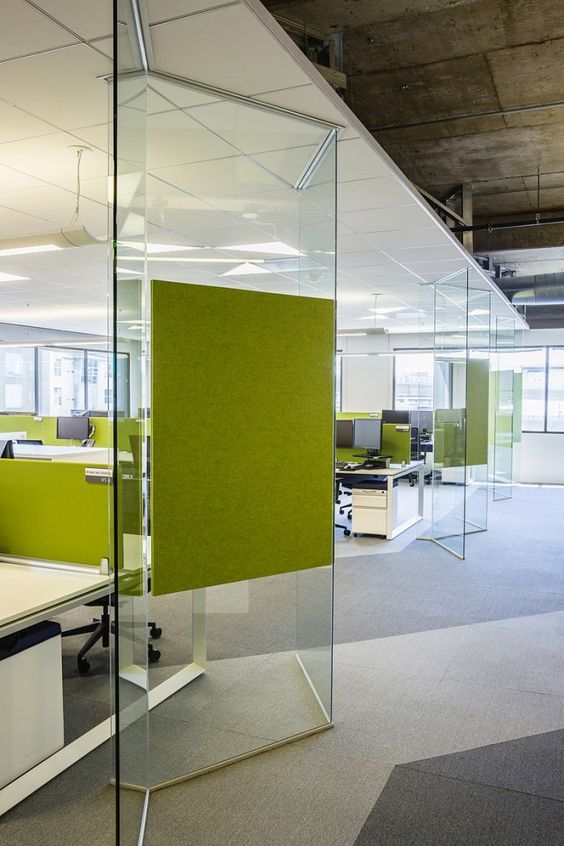
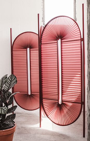
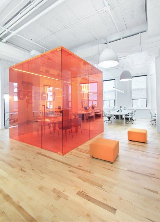
Screen blocks are a great way to create borders within offices without resorting to those boring and depressing cubicles. BLEH! It's also an opportunity to add some color or texture into the space. In the first image you see has tone-on-tone orange glass screens. I love this concept.
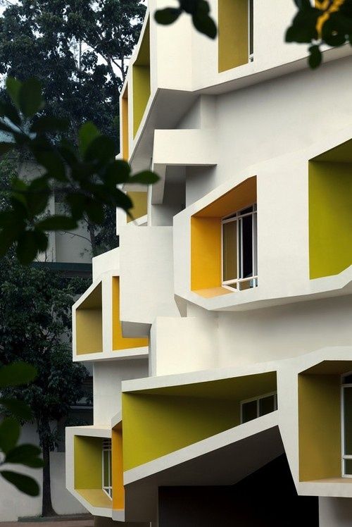
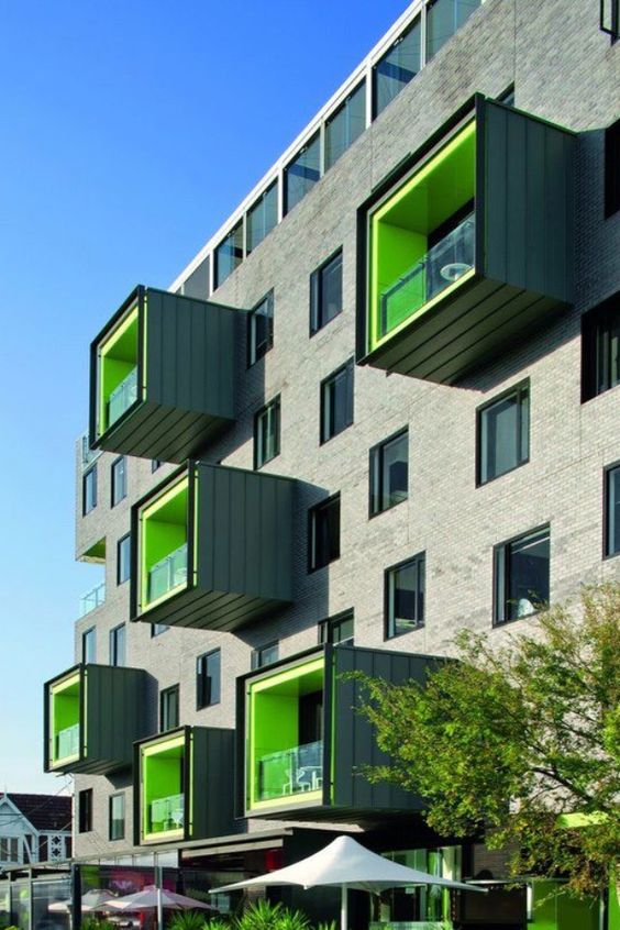
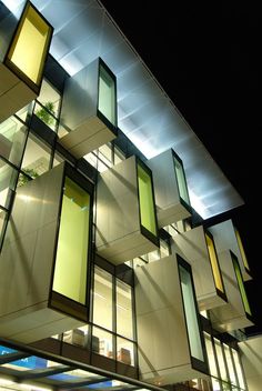
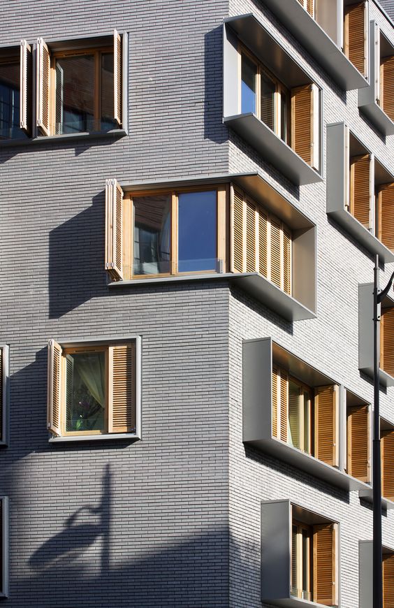
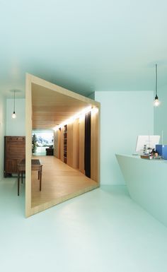
I've also been seeing these extruding pop-out windows in buildings all over Santa Monica and Culver City. Tech companies are moving into these cities, which is why new and modern buildings are being built. To be honest, when I first saw this trend, I was not a fan. But the more I see it and how it connects with other modern design elements, the more the trend grows on me.
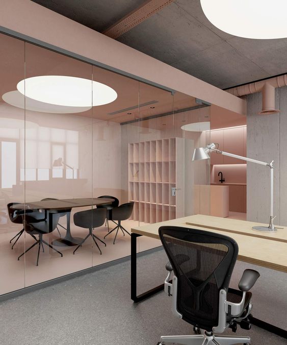
This trend is Millennial Pink! I have been head-over-heels in love with this color as of late. I'm not sure what the psychology is behind a color becoming a trend, but it does. I've actually heard rumors that this was a trend of 2017 and that it's going to evolve into lavender in 2018. I'm excited to see if that trend forecast comes true.
Color cubes have been seen in offices and schools. I think this is a really cool concept for a conference or study room. The first time I saw this trend was at FIDM Los Angeles. It was a blue color cube that appeared as if it was floating above the first floor of the Annex library. I remember thinking that it was so cool and such an 'off the wall' concept. I also think that being in a room that is one color can help you stay focused on your work.
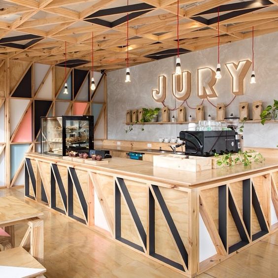
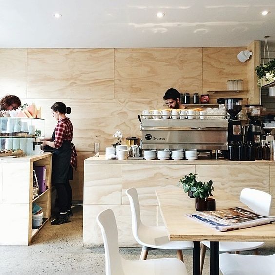
The last trend I'm going to talk about has been seen in coffee shops and that is the all-over plywood look. I think what makes this design concept so well-liked is that is looks homemade and casual. The first time I saw this trend was actually in an Urban Outfitters store. I also like the tone-on-tone look of it.
