Design Reveal : Gender Neutral Nursery
It's time for yet another e-design reveal and I'm so excited to show you guys! This is my second nursery I've designed and probably won't be my last :)
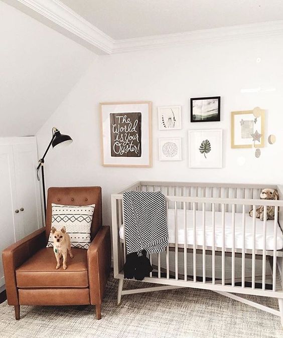
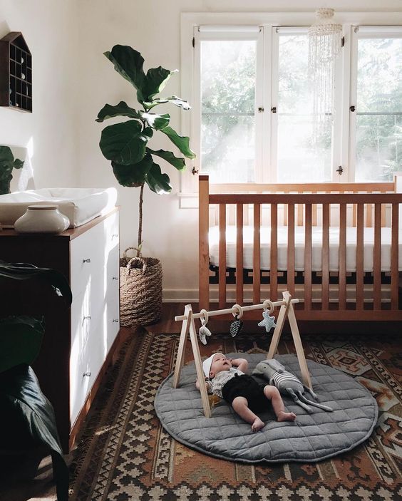
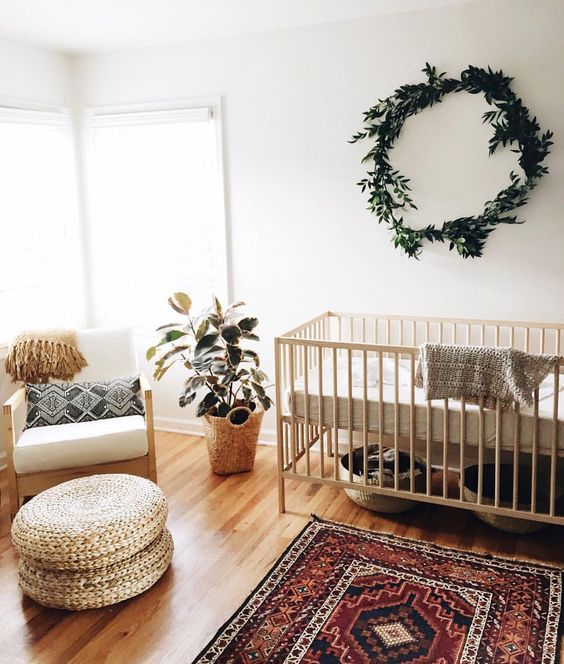
Inspiration : I liked these photos as inspiration, because they aren't your typical nursery. Most nurseries have some sort of theme and are loyal to the gender of the baby. Trust me, I don't have anything against those sort of nurseries, I've just been feeling an itch to try something different! I also love how these rooms showcase wood, bright walls, and plants!
Plan : This nursery is to be gender neutral, with slight hints that it belongs to a baby girl. The room came with a built-in closet that turned a 12' x 11' room into a 10' x 11' room. A smaller room always poses a challenge, but nothing is impossible when it comes to design!
Color Scheme : The overall scheme is neutral, creating a calm and serene atmosphere, while, at the same time, including some pops of color through the use of accessories.
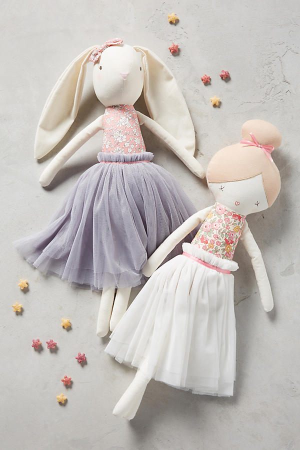
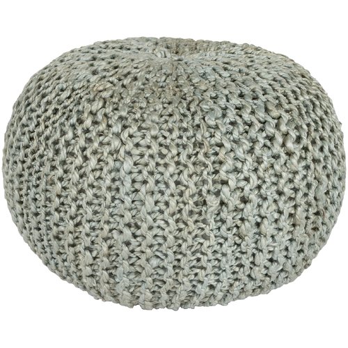
Crib, Floor Light, Rug, Dresser, Chair, Crib Bedding, Dolls, Flush Mount, Pouf
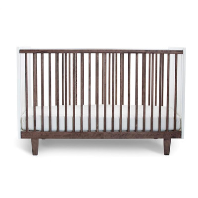
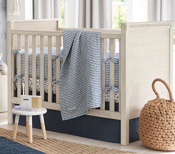
Crib : I chose this crib because the darker, richer wood paired with the white accent brings a nice contrast and warmth to the room. The outward direction of the legs and inclusion of wood brings a hint of mid-century, which is all the craze with nurseries right now.
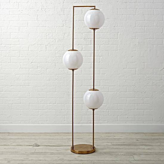
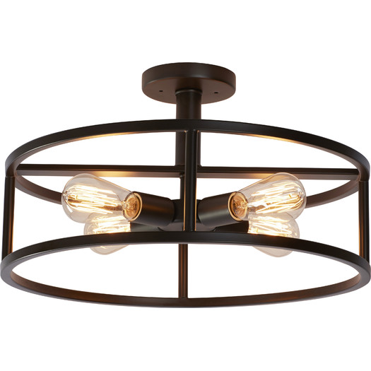
Lighting : I love this flush mount from AllModern because it provides a nice, beautiful sight for the ceiling, especially when some can really be an eye sore... Also, I like this floor lamp from Land of Nod, because of the globes and fine brass details. It is a kid size lamp, so it's a bit smaller than the average floor lamp. But if you plan on keeping it for the years to come, it's great for the little ones to have!
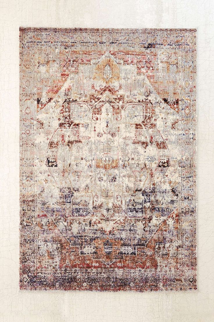
Rug : It is the focal point of the room and adds charm and color!
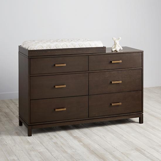
Dresser: Serves as both a dresser and changing table, a great combination for a small room. Land of Nod has so many great options, but this one stuck out to me. The richness of the wood and the sleek shape provides a modern feel with a down-to-earth touch!
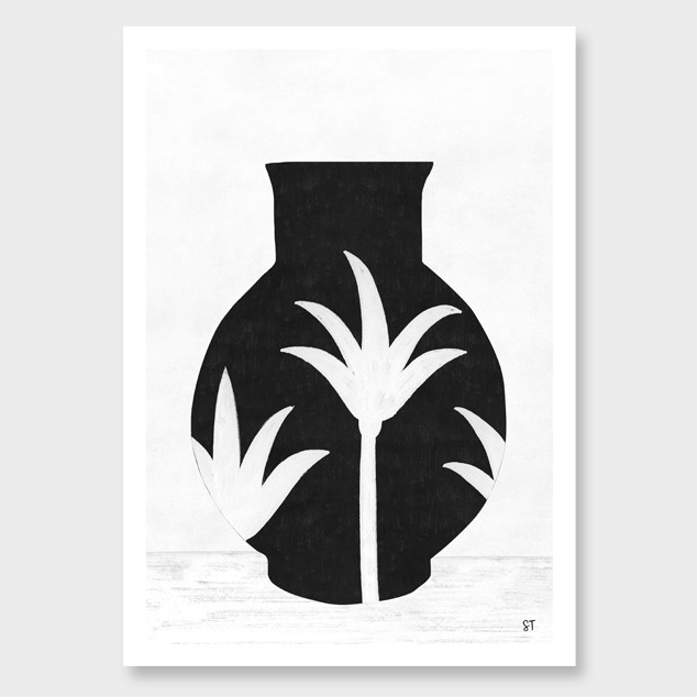
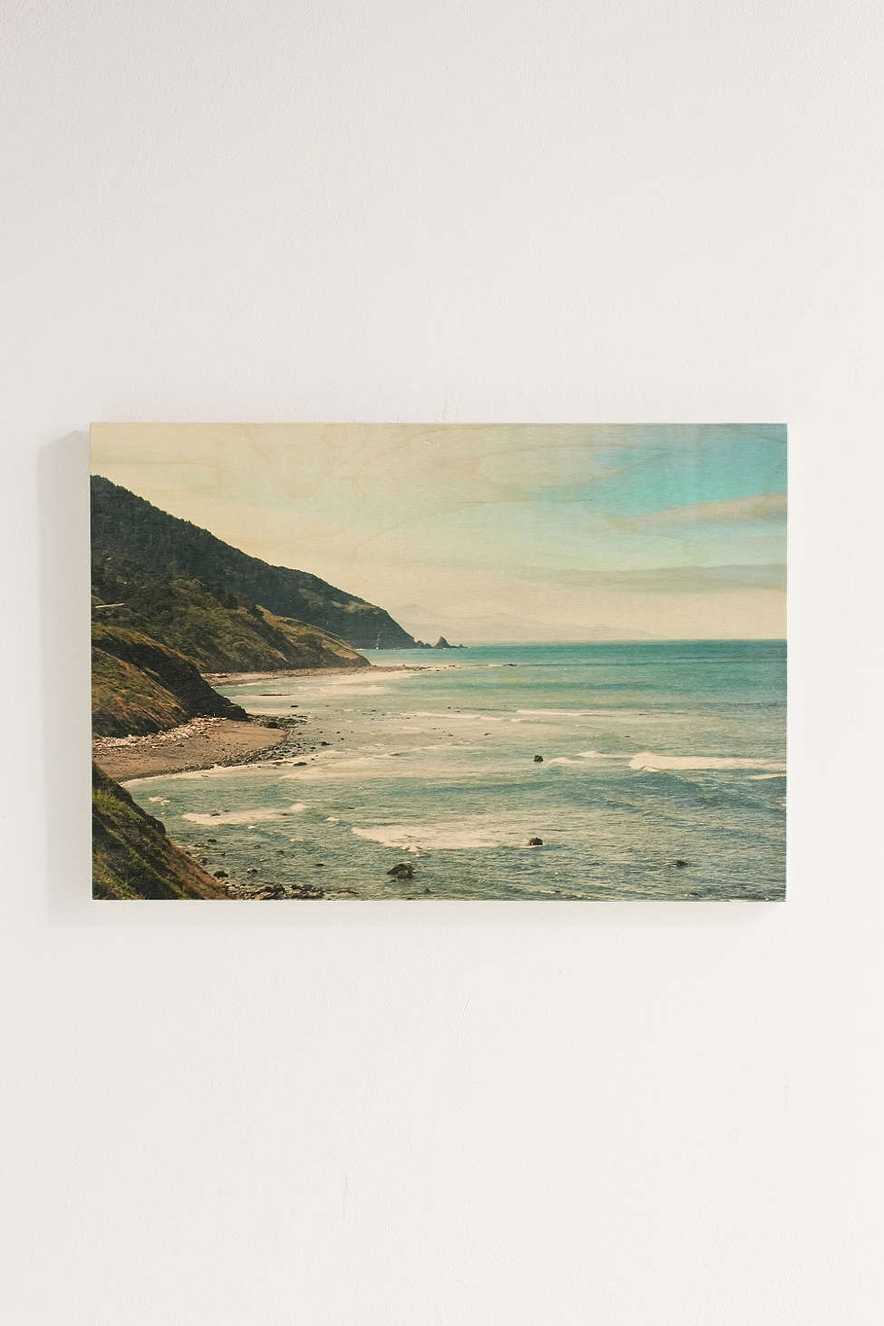
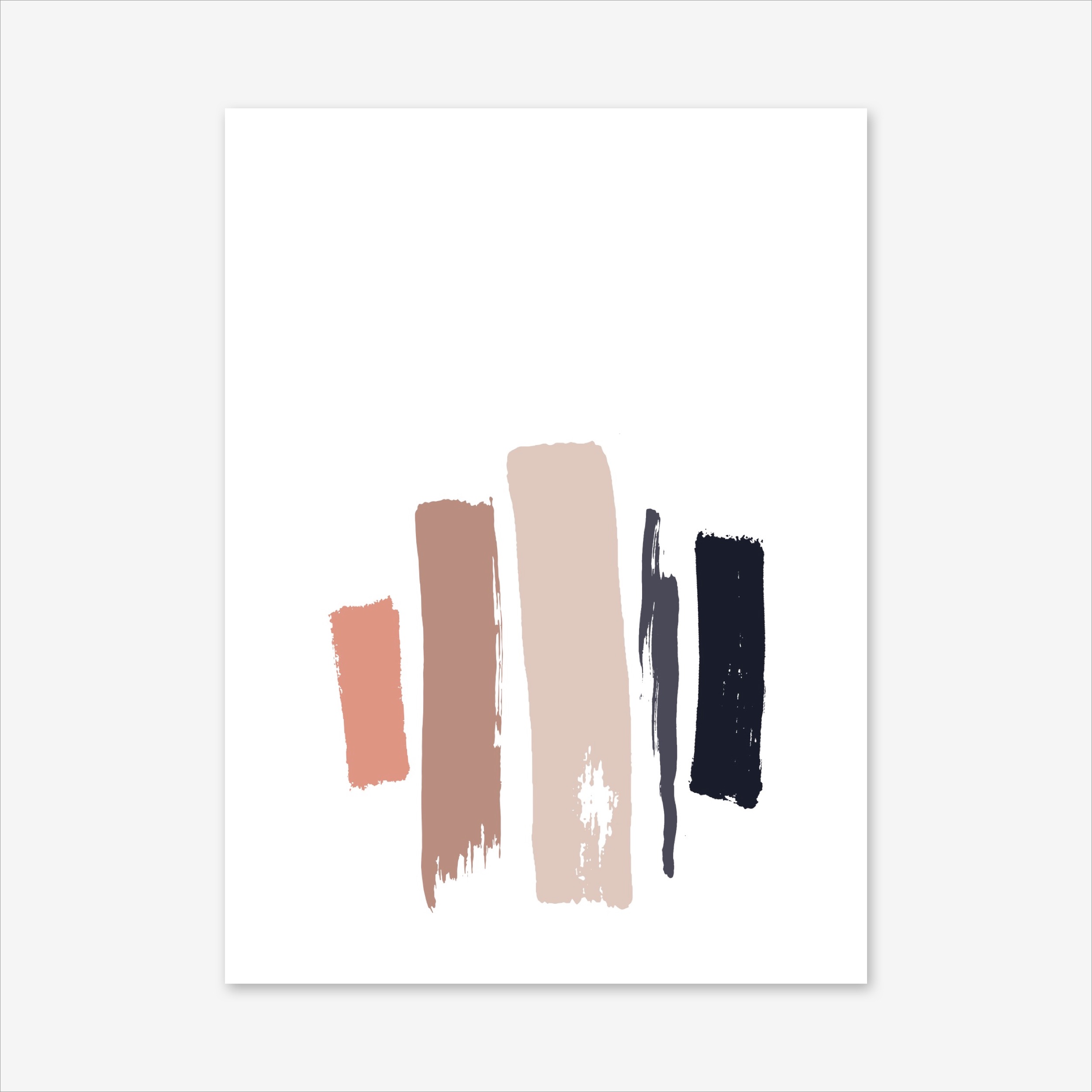
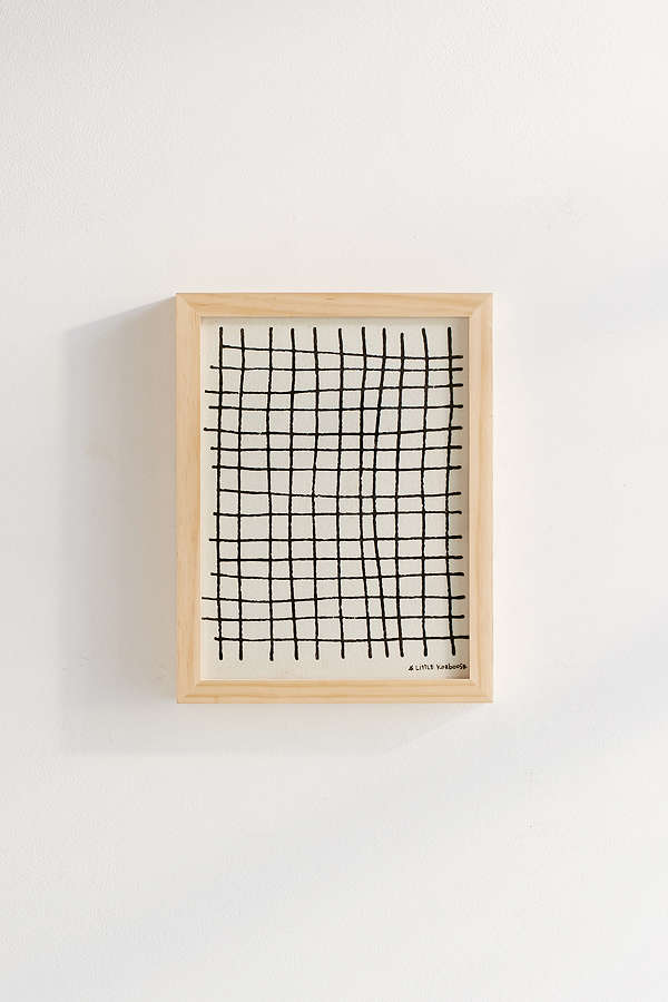
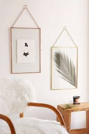
Art : All of the art is from Urban Outfitters! I just love their graphics. I chose mostly black and white pieces with only a couple of colorful ones, so that is wouldn't become overbearing!
