Design Reveal : Malou's New Living Room
I'm excited to share the news that I've been working on designing a wonderful family's New Living Room !
Malou wanted to use her living room as a family room and a place where the family could gather around, hang out, and read together. We wanted to transform their living room into a place that was bright, open, and inviting!
To do this, we started with changing the color of the walls. We went from a warm color, to a brighter grey that made the room feel cooler in tone. And in doing so, we really open up the room and made it feel larger.
In terms of laying out the furniture, the shape of the room and placement of the doors really proposed a challenge: centering the furniture around the fireplace. In order to center the furniture around the fireplace, we were left with only one layout, which is their existing one. But we wanted to do something different and change it up! So, instead of making the fireplace the focal point, we placed a colorful gallery wall on the far wall, creating a new focal point. That way it would't feel awkward if the furniture wasn't centered with the fireplace.
From this point on, we had so many options for the layout of the room. I was considering attaching benches to the corner window, so that they could have more storage and seating. But I decided against it due to the limited budget and prioritizing the area rug and chairs that I wanted for them.
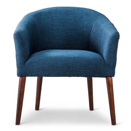
I knew that I wanted to get rid of one of their sofas and replace it with chairs so that we could have more options when it came to the layout. If I got rid of the smaller sofa and replaced it with 2 chairs, I wouldn't be eliminating seating and it would add a LOT more space! I selected the blue chairs, because I wanted a fun, colorful statement piece. Having a statement piece is great to have in a communal room, because it's a great conversation starter and a focal point.
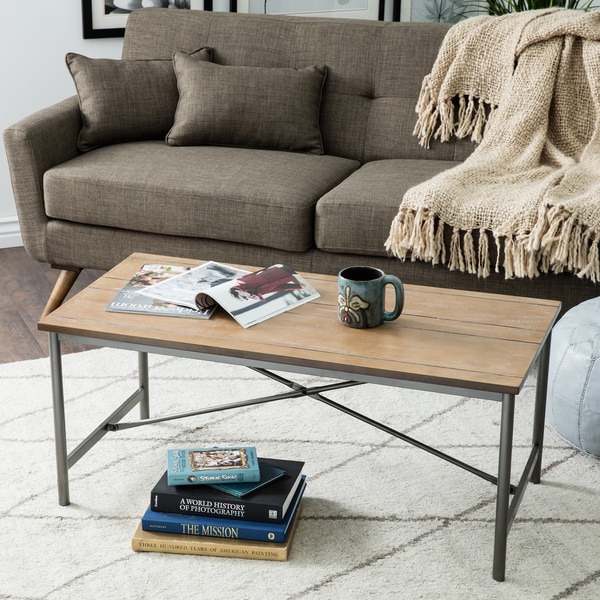
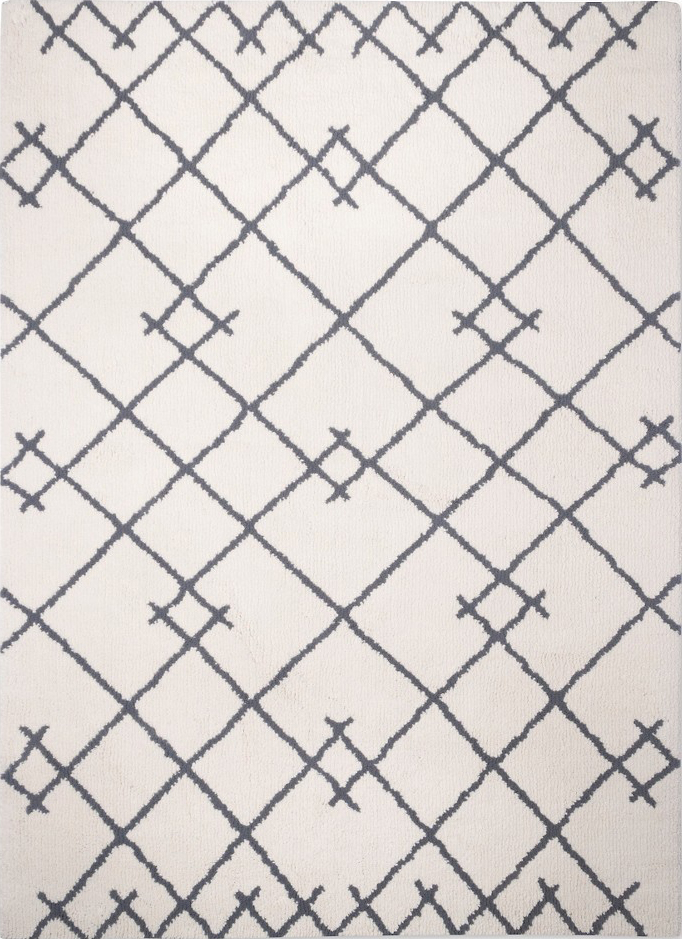
I chose a white area rug, because a rug would separate the furniture from the pathway to the french doors and I chose white because it would help make the space feel brighter and larger.
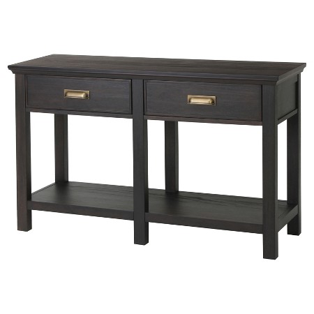
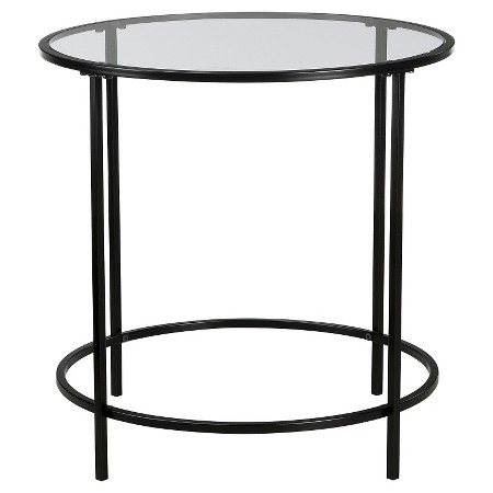
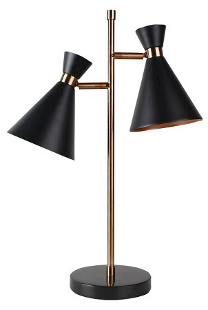
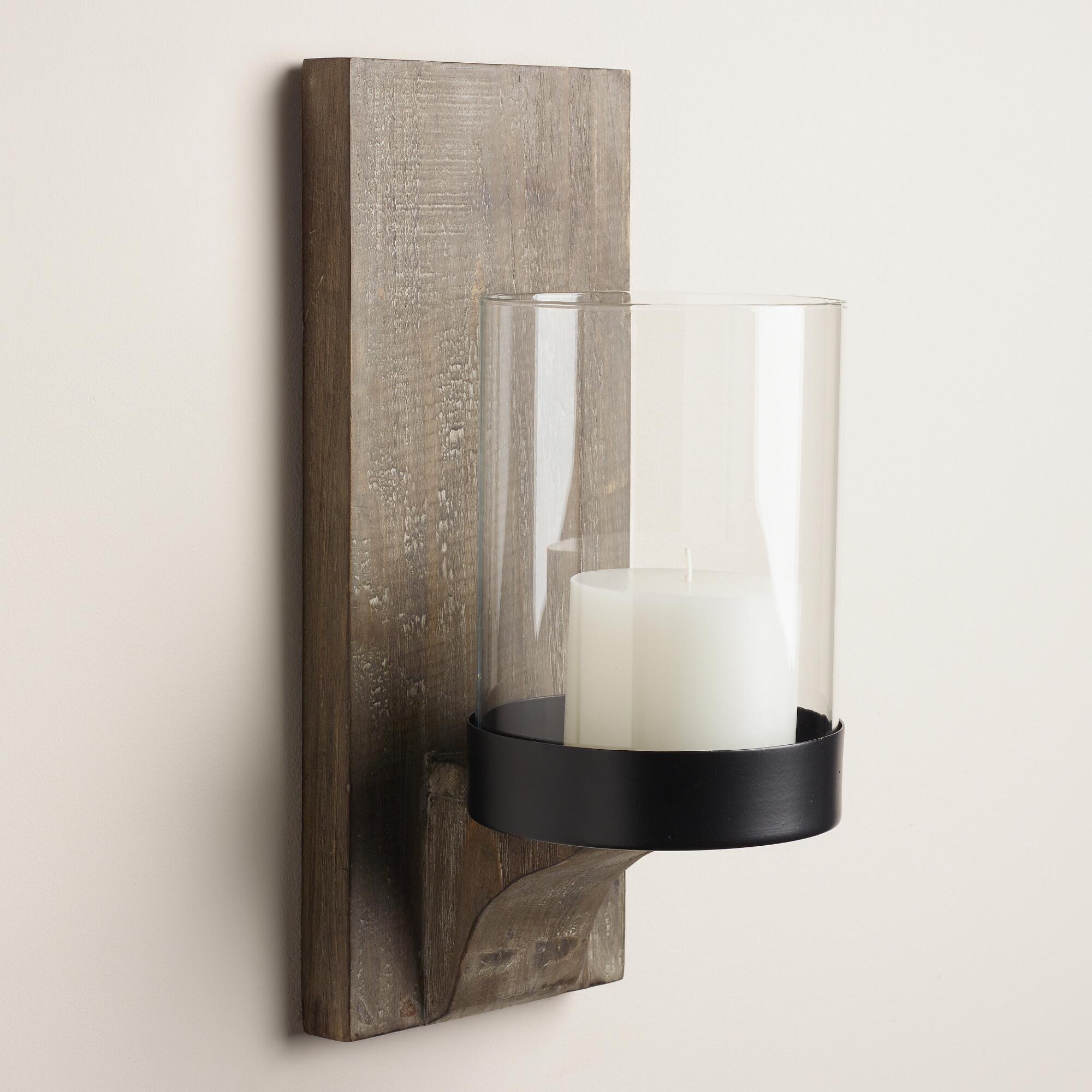
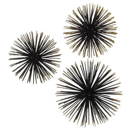
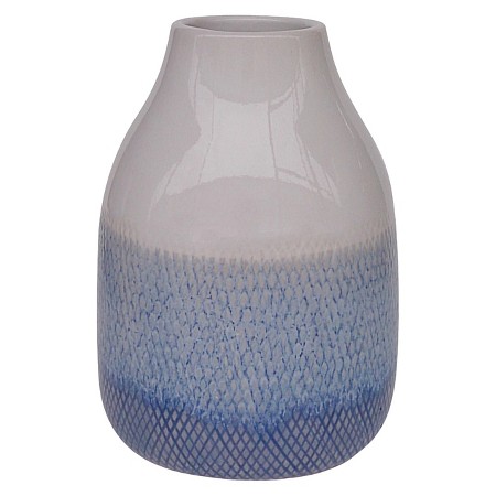
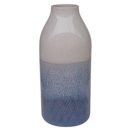
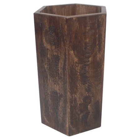
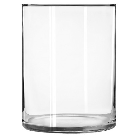
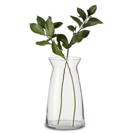
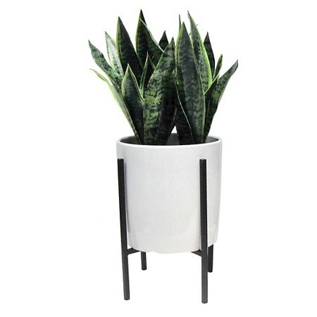
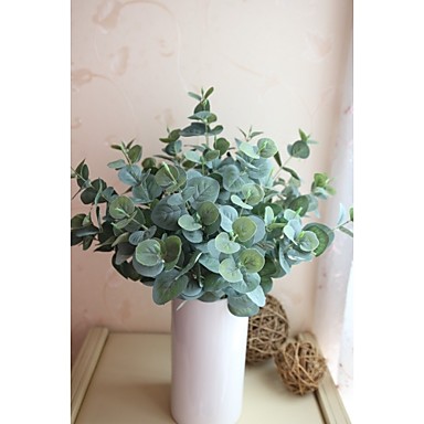
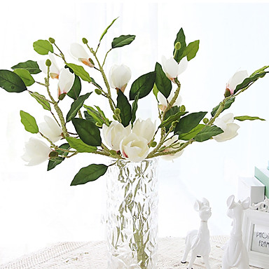
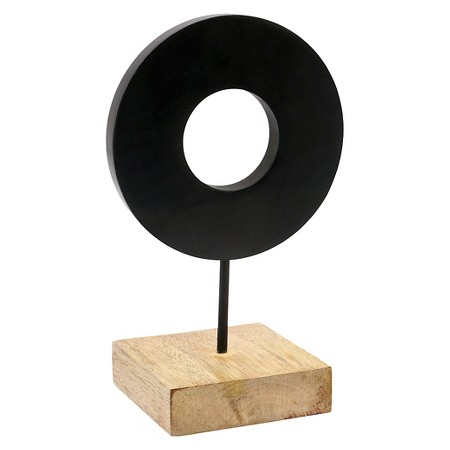
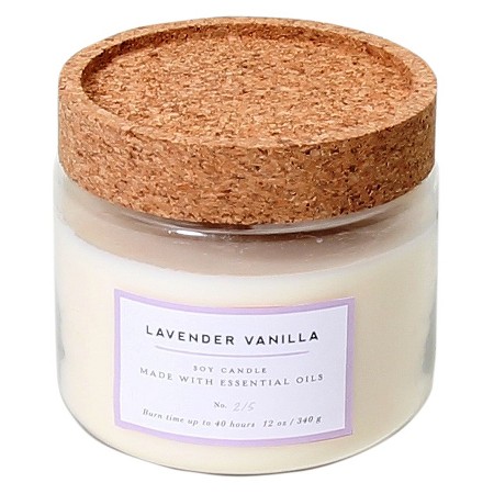
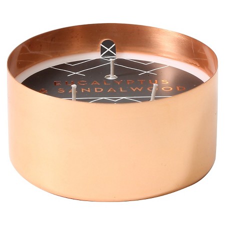
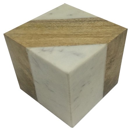
Most of the decor is from Target. They have such fun and affordable pieces, that it makes it too easy on me! I chose bohemian and earthy items as well as items made out of different materials such as brass and iron. It's good to mix up your materials and have some contrast!
Before :
After :
Alternative Options :
Here is where you can shop this design:


