Design Reveal : SMC Student Show
Fall 2018 semester has come to an end and this was my last project presented! This project was a special one for two reasons: my studio class (Studio 2) was paired up with Studio 3 and we were assigned the task of designing our school’s first ever student show. Our professors assigned us into groups, blending the two studio classes.
The Center for Media and Design is a satellite campus of Santa Monica College and houses many programs including: Entertainment Technology, Graphic Design, Interaction Design, Interior Architectural Design, Media Content Development, Film Production, Critical Film Studies and Promo Pathway. General education courses are also provided at the satellite campus.
Since this project is going to be applied in real life, we were given real limitations.
We were not allowed to “touch” the buildings in any way. That means we couldn’t puncture any walls, suspend anything from the ceilings or hardwire any lighting.
We had to find ways to display the work of all of the programs offered on our satellite campus.
Our designs needed to be temporary, semi-permanent, modular (designed to taken apart and reassembled), and storable.
Since this was a project that our professors wanted to actually pitch to the dean, we had to design something easily made and cost efficient.
The first thing my group did was walk around our campus and brainstorm. We looked at every nook and cranny, thinking about what we could design and taking all of the majors into account. The two main programs the SMC Student Show will focus on are Interior Architectural Design and Graphic Design. Interior Architecture students showcase their creative projects of space planning, designing, furnishing of residential and commercial interior space, and set design. The Graphic Design students exhibit their artistic works of print, motion, web, and mobile design.
The displays will be viewed by students, faculty, investors, industry professionals, and other members of the community. This show allows viewers to learn about the school and gain inspiration. For the students whose work is on display, the show provides them with a sense accomplishment, pride and an encouragement.
The yellow region represents where my teammate Rosemary’s design was going to be, the blue represents my teammate Raylene’s design, and the green represents my design. The types of display are as follows:
Digital works: Each of the programs produce digital works ranging from animations, films, graphics and renderings. There are various sites on campus that showcase these works on screens, such as in the auditorium and numerous corridors.
Flat works: The Interior Architectural Design program produces hand-drawn and computerized works which are displayed in paper or mounted formats ranging in size (8.5” x 11”, 11” x 17”, 14” x 20” & 20” x 30”). The Graphic Design program generates works that are displayed in a wider range of flat work formats including business cards, greeting cards, brochures, posters, etc.
Models: The Interior Architectural Design program create 3D models that are freestanding and/or suspended. The sizes range anywhere from 1” x 1” to 24” x 24” or no larger than a basketball, give or take.
The following is everything relating to my individual design (the green portion). My design intent:
Student work: The key focus of the student show will be the students’ work. The structure, function and design of the various displays will support the students’ work and not distract from the main focus.
SMC brand: The Center for Media and Design has a very fun, modern style that is bright with saturated colors of yellow, green and orange. There is also an industrial touch which is seen in the corrugated metal walls and plywood accents. The main colors of Santa Monica College are blue, green and yellow.
Inspire: The student show is also meant to inspire others to pursue and prosper in design. The theme of the satellite campus is “Designing the Future” and this will be the concept of the student show.
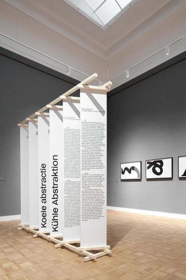
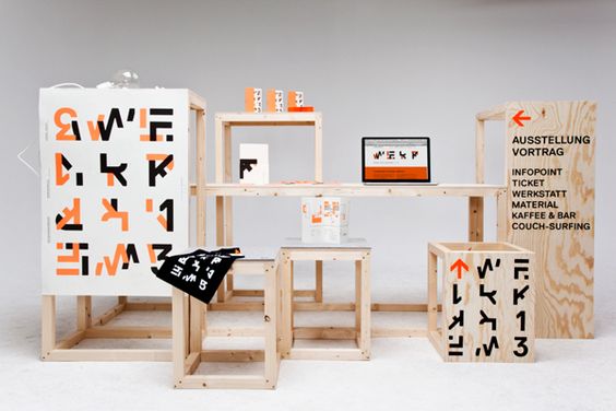
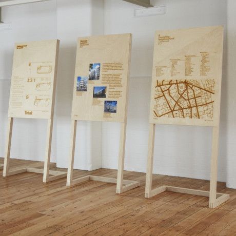
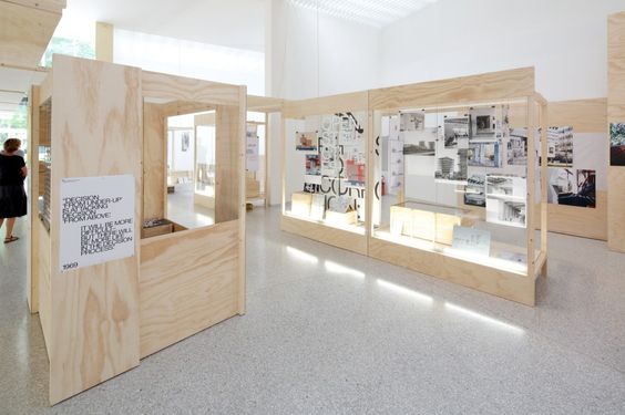
Inspiration:
Floor Plan:
Design One:
I designed this “tower” with the mindset of a directory. I wanted viewers to be able to walk around it and view the different students’ work. There is 6 feet on every side, providing crowds with ample walking space. This display would feature the flat works of the interior architecture, graphic design, media content development, and promo pathway programs.
The tower is 5’ x 5’ x 7’, a dimension I got by using the maximum total space this location allowed. However, I noted to my professors that realistically, the tower would best be built with the dimensions of 4’ x 4’ x 8’, since plywood comes in 4’ x 8’ sheets. They could make it 5’ x 5’ 7’ if they wanted to, it would just cost more and they would be left with a lot of wasted wood. These are very “real” issues that designers have to face and it was good practice for me to take those facts into consideration.
Design Two:
This “window box” was the only design in our group that was meant to be semi-permanent. The function of this box was to be able to roll in and out of this space so the work could be swapped out and people view the work walking into the building. This location is in the front entrance of the school, right off of the main road. It could showcase flat works and models. It even allows for suspending models and installing up lights on the bottom.
The dimensions were designed so that the box is custom made for the space.
Below is a model I made of the window box. I used bass wood and tacky glue to assemble it.
This was a great project because it taught me how to work in a group setting and we got to work with a real space that we measured and walked through. We even presented our models and powerpoint slides to the dean himself! He seemed very impressed with all of the groups’ designs and I can’t wait to see what happens from here. Our professors will get together with the head of each department, show our designs and talk about which ones they can actually execute. I unfortunately won’t be a student at SMC by the time the show is created, but I will definitely come and see the finished product!
I hope you guys enjoyed reading this post. I won’t be sharing any school work until a year from now since I just have general education courses until I get to CSULB.
BUT I will definitely keep designing on my own and sharing them with you guys.


